Interiors shaped around your personality, for the mountain life you actually want to live, host, and come home to.
Most design starts with a style. Ours starts with you: how you unwind, how you host, what a space needs to feel like before it feels like home. It's interior design grounded in psychology, not just taste.
Two decades of work across luxury estates, private yachts, and coastal residences, now brought home to the mountains of Big Bear and Lake Arrowhead.
For residents and second-home owners. A mountain retreat designed around your life, not a catalog. The place you actually want to come back to.
Start with the test →For rental and short-term-rental owners. Interiors that attract better guests, command higher rates, and hold up to real use. Design as a return, not an expense.
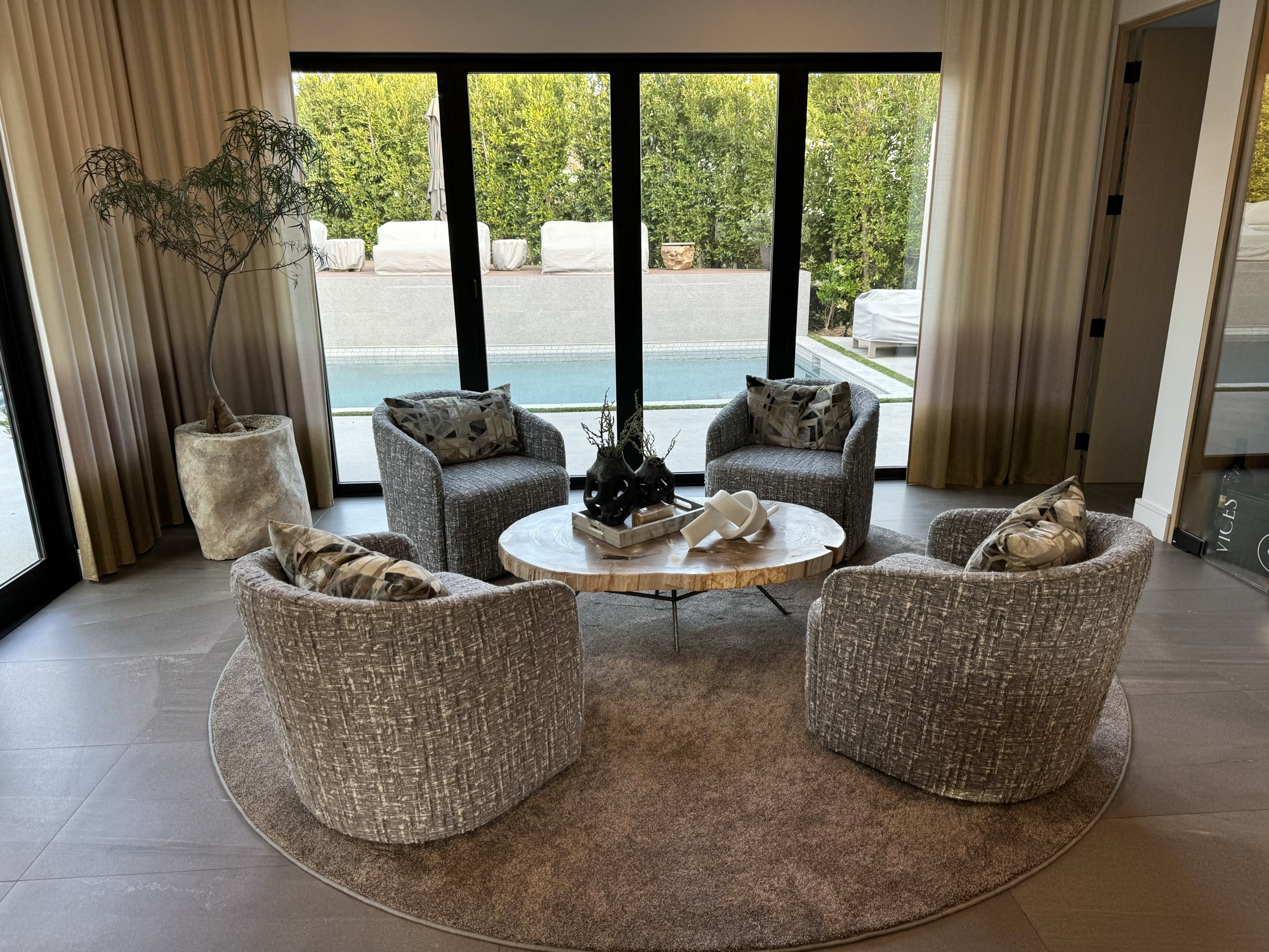
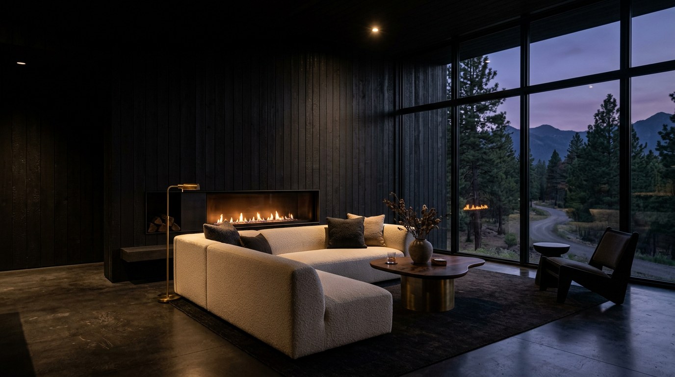
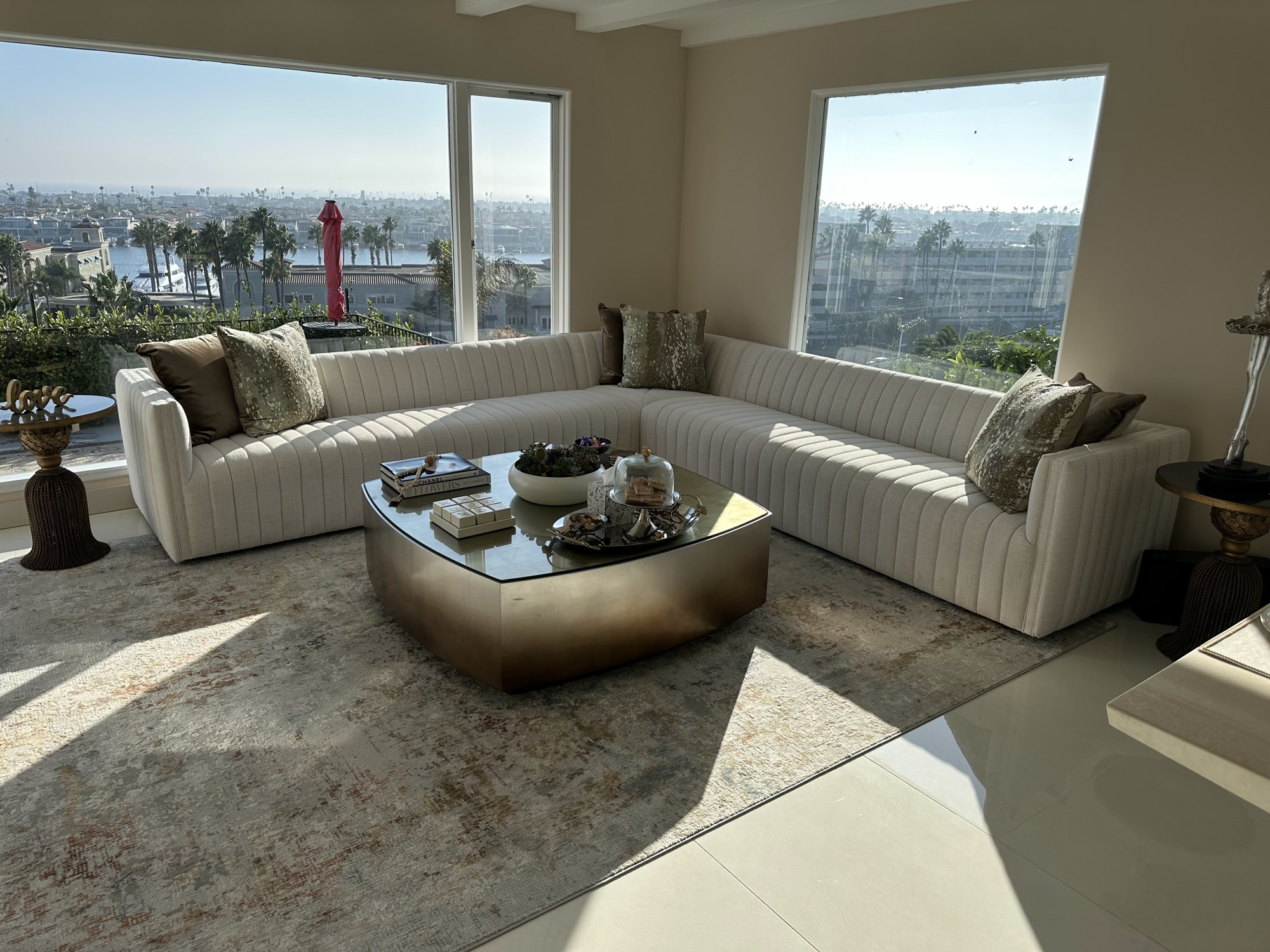
Talk to the studio →From dark mountain-modern to bright coastal luxury. Two decades of interiors across markets.
Snow, dirt, and altitude. We know what a mountain vacation is supposed to feel like, because we're out there too. That's the difference you can't fake.
Take the personality test and discover the interior that fits you: your palette, your textures, the feeling your home should have. Two minutes, built on real psychology.
Discover Your Design Personality